How to Make AI YouTube Thumbnails
The policy answer, the workflow that actually works, and the one real risk — specs, safe zones, design principles, tools, and testing.
Policy verified against YouTube Help, August 2026 · This area is changing — re-verify before publishing
AI thumbnails do not require disclosure. YouTube classifies them as production assistance.
The real risk is not AI. It is whose face is in the image.
The policy question, settled
Disclosure is not required
YouTube classifies AI thumbnail creation as "production assistance," so it does not require AI disclosure, which is reserved for realistic, potentially misleading synthetic media. — Gyre, on AI thumbnails
| What requires disclosure | What does NOT |
|---|---|
| Content that makes a real person appear to say or do something they did not — deepfakes, voice cloning, synthetic face replacement. | Unrealistic content, animations and special effects. |
| Altering footage of a real event or place in a way that changes what actually happened. | Production assistance — AI scripts, thumbnails, outlines. |
| Generating a realistic scene that did not occur. | AI-generated titles, descriptions and tags. |
| Anything that could reasonably mislead viewers into thinking a real person said or did something they did not. | Color correction, filters and basic editing. |
Sources: YouTube Help Center "disclosure is not required" list, as reproduced by ShortsFast and multiple 2026 creator guides; Gyre. The disclosure setting is the "Altered content" option under Show More at upload.
One guide puts it well: the disclosure policy "actually doesn't apply to most of what creators use AI for."
Scripts, titles, tags, thumbnails, outlines — all production assistance, all exempt.
The policy targets deceptive realism: AI used to make it look like something happened that did not. A stylized thumbnail illustrating your video is not that, and neither is an obviously illustrated one.
There is also no confirmed algorithmic penalty for using AI on a thumbnail. CTR depends on contrast, clarity and emotional pull — not on how the image was made.
But here is the real risk
From the official YouTube Help page on thumbnails: "YouTube does not allow unauthorized impersonation of a person, entity, or channel that may mislead viewers in a way that could harm the YouTube community."
And directly: "It may also include using AI to copy the voice or likeness of an individual, to make it appear as if the channel is owned or authorized by that individual."
The same page adds that YouTube also enforces trademark holder rights, and that thumbnails and other images violating Community Guidelines are not allowed — including banners, avatars and posts.
So the question is not "did AI make this." It is whose face is in it, and whether the image implies an association that does not exist.
The other prohibition that predates AI entirely
YouTube prohibits misleading thumbnails under its spam and deceptive practices policies, and violations result in strikes or removal. A thumbnail that promises something the video does not deliver is a policy problem regardless of how it was produced. AI makes it easier to generate a dramatic image that has nothing to do with your content — which makes this rule more relevant, not less.
Source: ThumbMagic YouTube thumbnail specs guide, referencing YouTube's spam and deceptive practices policies.
One 2026 analysis notes that AI-generated thumbnails are not subject to mandatory disclosure "as of early 2026" — while explicitly flagging that this may change.
The same source reports that from May 2026, YouTube uses automated detection to identify significantly AI-generated photorealistic content, applying a label automatically where the creator has not disclosed.
Whether that detection extends to thumbnails is not established. Treat the current exemption as current, not permanent, and re-verify before publishing anything that states it as settled.
Specs and safe zones
The technical requirements
| Spec | Value |
|---|---|
| Recommended resolution | 1280 × 720 pixels |
| Aspect ratio | 16:9 |
| Minimum width | 640 pixels |
| Practical minimum | Upload at 1280 × 720. Thumbnails near 640–1000px will upload but appear pixelated on larger screens like TVs and desktop monitors. |
| Formats accepted | PNG, JPG, GIF |
| File size | Keep it under YouTube's stated limit — verify the current figure in YouTube Help before publishing a number. |
Source: ThumbMagic, "YouTube Thumbnail Size (2026): 1280x720 Specs + Safe Zones."
Where the interface eats your design
Keep text and faces away from the edges — and especially out of the bottom right quadrant, where YouTube overlays the video duration and other elements.
This is the most common technical mistake in thumbnail design, and it is entirely avoidable. Anything you place there will be partially covered in the feed.
Design with a margin. Put your focal content in the middle and upper areas.
Composition
| Principle | Application |
|---|---|
| Rule of thirds | Place focal points at the intersections of a 3×3 grid. Most editing tools include this overlay in their crop function. |
| Negative space | Empty space directs attention. Do not pack every pixel with information. |
| Edge margin | Keep text and faces away from all edges. |
| Word count on mobile | Limit to 3–5 words. Most views are on small screens. |
What actually drives clicks
CTR still depends on contrast, clarity, and emotional pull, not on how the image was made. — Gyre
Contrast
| Rule | Detail |
|---|---|
| The reliable combination | White text with a black stroke works on any background. If you learn one thing, learn this. |
| What fails | Low contrast — yellow on white is the named example. |
| Maximum contrast | Color wheel opposites. Blue text on an orange background pops visually. |
| Why it matters more than it seems | Your thumbnail competes at postage-stamp size against a wall of other thumbnails. Contrast is what survives that. |
Color by category
| Category | Common palette |
|---|---|
| Gaming | Red and orange backgrounds |
| Educational | Blue and white combinations |
| General principle | Match colors to content mood — but see the branding note in Part 6. |
Source: ThumbMagic. Note these are observed conventions, not rules. Deliberately breaking a category convention is one way to stand out — see Part 6.
The elements that consistently perform
- A human face with a clear, readable emotion. This remains the strongest single element across categories.
- A single clear focal point. Two competing subjects halve the impact of both.
- Three to five words maximum, in a heavy weight, high contrast.
- A curiosity gap — the thumbnail and title together should raise a question the video answers.
- Consistency with your channel, so returning viewers recognize you before they read anything.
- Something the competing thumbnails in that search result do not have.
Shrink your thumbnail to the size it actually appears on a phone and look at it from arm's length.
If you cannot tell what it is, read the text, and identify the emotion in under a second, it does not work — regardless of how good it looks at full size.
Most thumbnail failures are failures of scale, not of taste.
The workflow that actually works
Text rendering has improved substantially, but it remains the least reliable part of AI image generation — misspellings, distorted letterforms, inconsistent kerning.
It is also the part you most need control over: exact wording, exact font, exact size, exact position relative to the safe zones in Part 2.
The reliable workflow is two stages. Generate the image with AI. Add the text in an editor.
That takes about ninety seconds longer and eliminates the single most common reason AI thumbnails look amateurish.
The five-step process
- Write the concept first. What is the single idea, the emotion, and the three to five words? Do this before you touch a generator — a prompt written without a concept produces a nice image that sells nothing.
- Generate the image. Subject, expression, lighting, background, color direction. Leave deliberate empty space where the text will go.
- Select and clean up. Generate several. Pick one. Fix hands, artifacts and anything that looks wrong at full size.
- Composite in an editor. Add text with the contrast rules from Part 3, respecting the safe zones from Part 2. Add your channel branding element.
- Test at mobile size, then export at 1280 × 720.
Prompting for thumbnails specifically
| Include in the prompt | Why |
|---|---|
| The subject and a specific emotion | "Shocked," "delighted," "exhausted" beats "a person." |
| Framing | Close-up, medium shot, extreme close-up on the face. |
| Lighting | Dramatic side lighting, bright even lighting, rim light. Lighting does most of the mood work. |
| A simple background | Busy backgrounds destroy thumbnails at small size. |
| Negative space | Ask explicitly for empty space on one side for text. |
| Color direction | Name the palette you want, in service of contrast with your text color. |
| 16:9 or wide framing | So you are not cropping away your composition. |
| Not the text | See the warning above. |
The cost of an extra generation is trivial. The cost of shipping a mediocre thumbnail is a video that underperforms for its entire life.
Generate four to six. Choose from a set rather than accepting the first output.
And keep the rejects — a strong image that did not suit this video often suits the next one.
What we actually found testing this
The advice above is the standard guidance. We tested it against two current tools — Google Flow and Grok Imagine — on our own recurring character, and found something worth adding.
Eight separate generations, two different tools, one 3–5 word headline each time. Every single one rendered the exact requested text, correctly spelled, with no extra unwanted text anywhere in the frame.
The "don't let the AI render your text" warning above is still the safer default — this was a small sample and only tested on short headlines — but for that specific case, current tools handled it better than the warning assumes. Test your own tool before trusting it at scale.
We generated the same recurring character (described in text: hair color, beard, shirt) into two different settings on each tool. Every single kitchen-scene generation came out with a different shirt color, and one dropped the beard entirely. This happened on Flow and on Grok — not a one-tool problem.
The scene, lighting and mood held up fine. It was specifically the character that drifted, every time the setting changed.
Once we generated the character once and then asked the same tool, in the same chat or project, to change his setting — rather than re-describing him from scratch in a new prompt — consistency held completely. Same face, same hair, same shirt, across a kitchen, a car, and a grocery store on Grok, and a kitchen, a car, and an electronics store on Flow.
Grok Imagine makes this explicit — the character becomes its own reusable segment, separate from the background, that you can composite into new scenes. Flow achieves the same result by keeping the character in the conversation history and changing only the setting in follow-up messages.
If a recurring presenter or character matters to your brand, this is the practical takeaway: generate the character once, then iterate on setting within that same thread — don't start a fresh prompt per video.
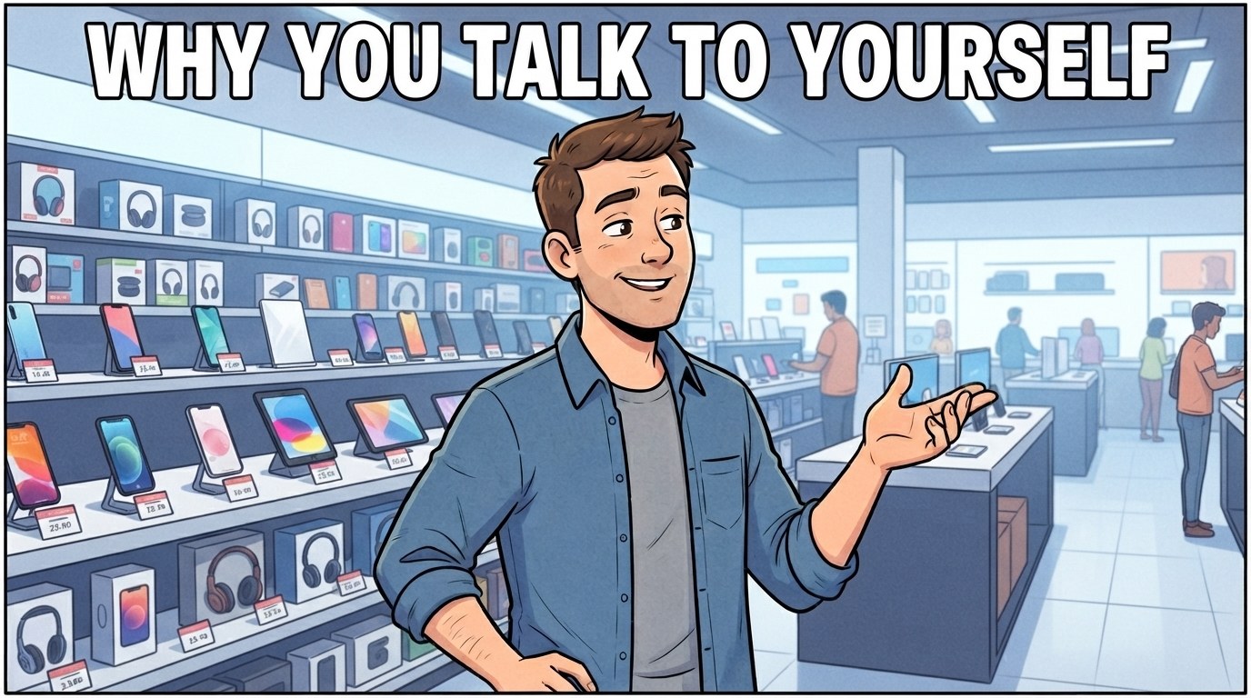
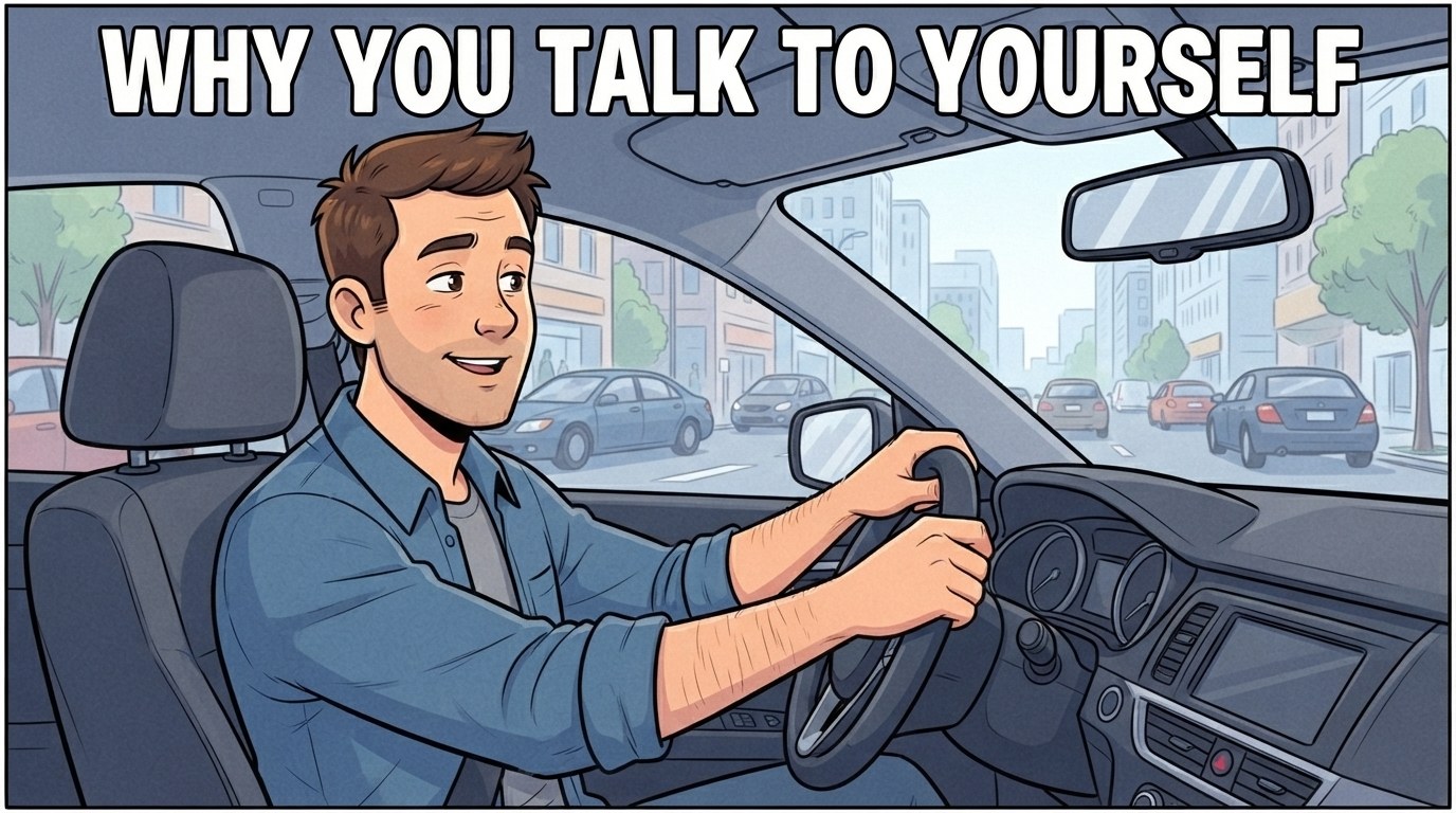
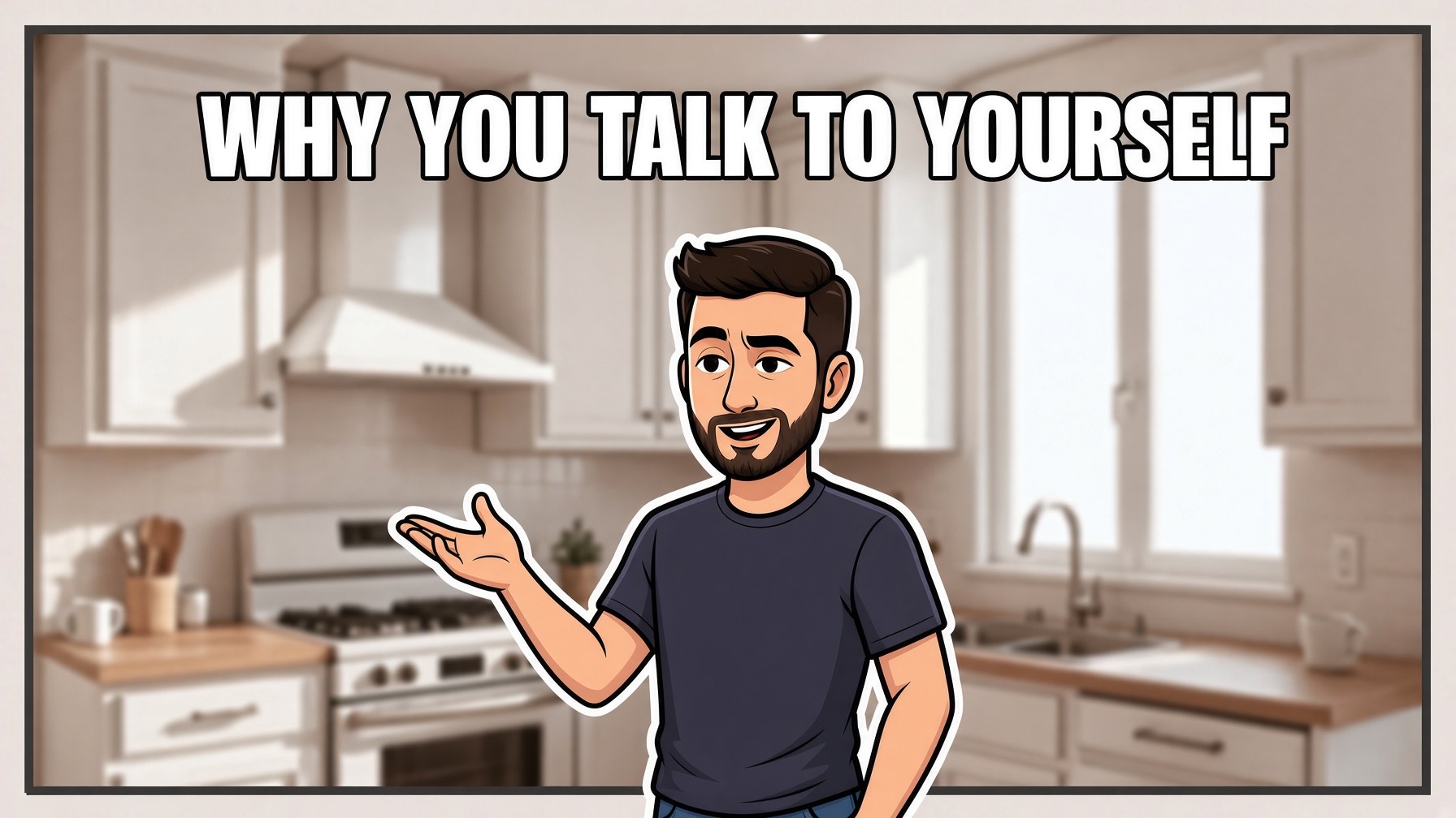
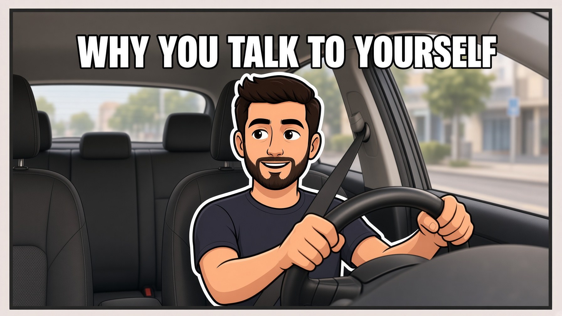
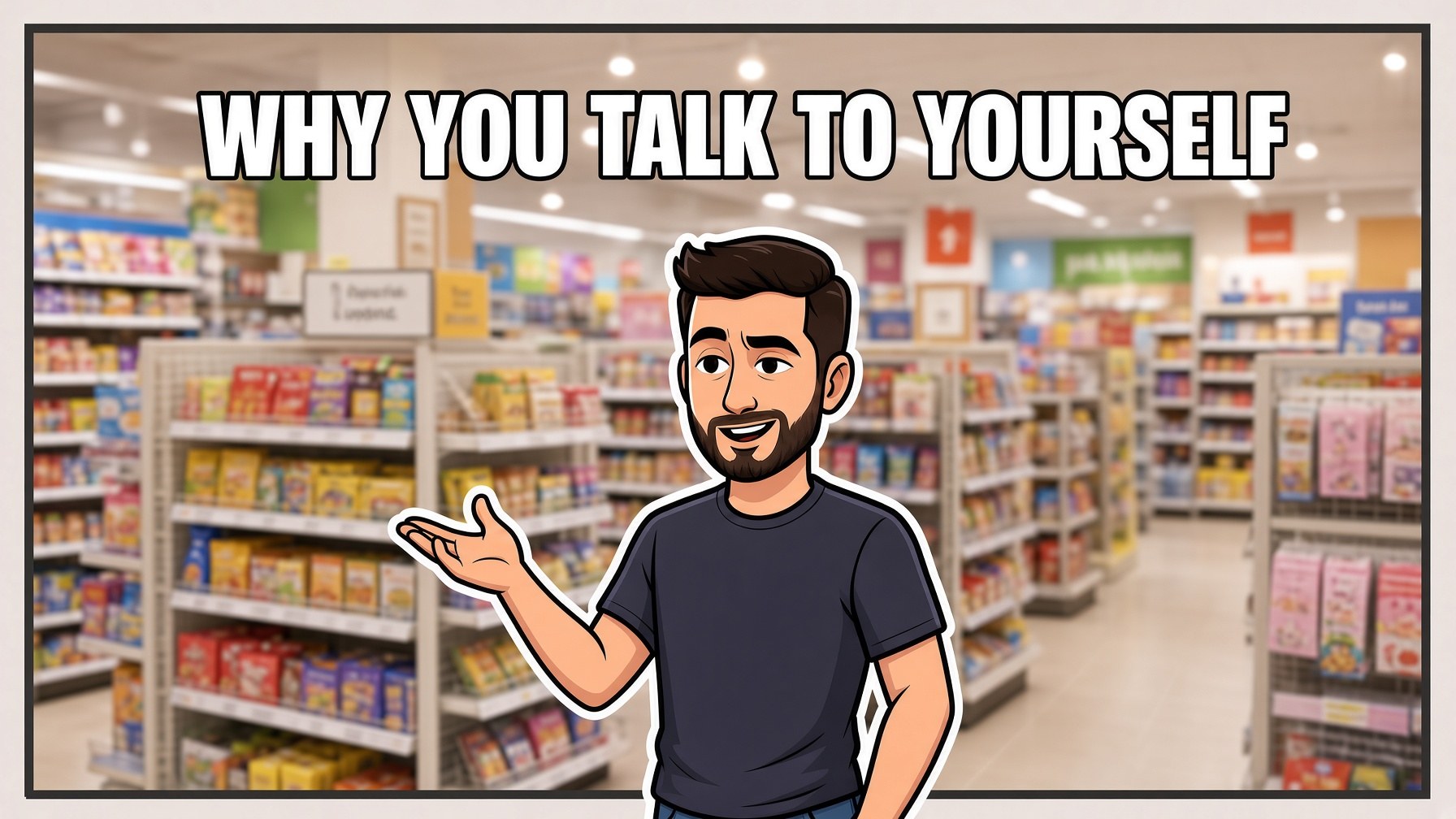
Five generations, two tools, one character, three settings. Same face, same hair, same shirt in every image — the difference from the earlier failed attempts was only the method: same chat/project instead of a fresh prompt.
Tools
The two categories
| Type | What it does | Best for |
|---|---|---|
| General image models | Generate images from prompts. Broadest creative range. | The image layer. Distinctive, non-templated results. |
| Dedicated thumbnail tools | Purpose-built for thumbnails — correct dimensions, text layers, templates, sometimes ideation. | Speed and consistency. Getting the composite done in one place. |
| Creator-suite tools | Thumbnail features bundled with keyword research, titles and analytics. | Workflow consolidation. See the VidIQ guide in this series. |
| Traditional editors with AI features | Generative fill, background removal, object removal on top of a real editor. | Compositing and cleanup — stage four above. |
One to generate the image, one to composite the text and branding.
All-in-one thumbnail generators are fast, and the tradeoff is that their template library is the same template library everyone else is using. See Part 6.
A general image model plus any competent editor gives you output nobody else has.
Choosing
| Priority | Choose |
|---|---|
| Speed above all | A dedicated thumbnail generator with templates. |
| Distinctive look | A general image model plus an editor. |
| Consistent recurring character or presenter | A model with character consistency features. |
| Already in a creator suite | Use its thumbnail tools for the composite, generate the image elsewhere. |
| Text rendering quality matters to you | Some models handle text notably better than others — but still add final text in an editor. |
| Budget zero | Free tiers plus a free editor will produce a competent thumbnail. |
The example thumbnails on this page were generated with Google Flow (flow.google) — the tool that absorbed Whisk's image remixing after Whisk was discontinued as a standalone app on April 30, 2026. Flow now combines image generation, editing, and video generation in one workspace.
We generate the image in Flow, then composite text separately, following the exact two-stage workflow in Part 4.
This whole build runs on RevID.ai
Video production is a separate layer from thumbnails — every video on this site uses RevID.ai. 20% off with code THEAIBUILDLAB.
Try RevID.ai →The homogenization problem
Rather than dropping AI thumbnails altogether, the more durable move is to keep your branding and composition distinctive enough that a viewer recognizes your channel before they have even processed the text. — Gyre
When everyone uses the same generators with similar prompts and the same template libraries, thumbnails converge. Same lighting, same expression vocabulary, same color grading, same composition.
Which means the thing that made a thumbnail stand out last year makes it blend in this year.
The advantage is not in using AI. Everyone has that. The advantage is in having something recognizable that survives the convergence.
What holds up
| Element | Why it survives |
|---|---|
| A consistent brand element | A color, a frame, a font, a mark that appears on every thumbnail. Viewers recognize the channel before reading anything. |
| A consistent presenter or character | A face your audience knows. |
| A deliberate palette | Choosing a color direction and holding it, even against category convention. |
| A composition signature | Consistent framing that becomes yours. |
| Actually different concepts | The image style converges; the idea does not have to. |
| Real photography where it counts | Increasingly distinctive precisely because it is less common. |
"AI thumbnail tools dramatically lower the cost and time needed to produce a clickable thumbnail, but they don't remove the need for creative judgment."
That is the correct read. The tool removed the production bottleneck. It did not remove the need to have a good idea about what image would make someone click.
This is the same conclusion as the faceless channel and VidIQ guides in this series, arriving from a different direction.
Testing and iteration
Where to look
| Metric | What it tells you |
|---|---|
| Click-through rate | The thumbnail and title working together. You cannot separate them. |
| CTR by traffic source | Browse, search and suggested behave differently. A thumbnail can do well in one and poorly in another. |
| Impressions | A low CTR on very high impressions is a different problem from low CTR on low impressions. |
| CTR over time | Thumbnails can fade as a video ages out of promotion. |
| Retention | A high CTR with poor retention suggests the thumbnail overpromised — which is a policy issue as well as a performance one. |
If a thumbnail is pulling clicks that immediately bounce, the thumbnail is writing a check the video does not cash.
That hurts you algorithmically, it erodes trust with returning viewers, and at the extreme it is the misleading-thumbnail policy problem from Part 1.
The target is a thumbnail that attracts the people who will actually watch — not the maximum number of clicks.
Iterating
- Change one variable at a time. A new image and new text tells you nothing about which worked.
- Give it enough impressions to mean something before you judge it.
- Update thumbnails on older videos that underperformed — a video with good retention and poor CTR is the highest-value thing to fix.
- Keep a record of what worked. Patterns emerge across a channel that are invisible on any single video.
- Look at what is actually in the search results you compete in, not at thumbnail advice in general.
The simplest useful test
Put your new thumbnail among nine competitors' thumbnails at mobile size and ask someone who has not seen it which one they would click. That is closer to the real decision than any amount of design theory.
The spirit of this comes from Gyre's closing suggestion: before you upload, ask your loved ones if they would click on it. After all, what matters is that your audience likes it, not what made it.
Real examples from this site
Following the two-stage workflow from Part 4 — image generated in Flow, text added separately. Prompt included for each so you can see exactly what produced it.
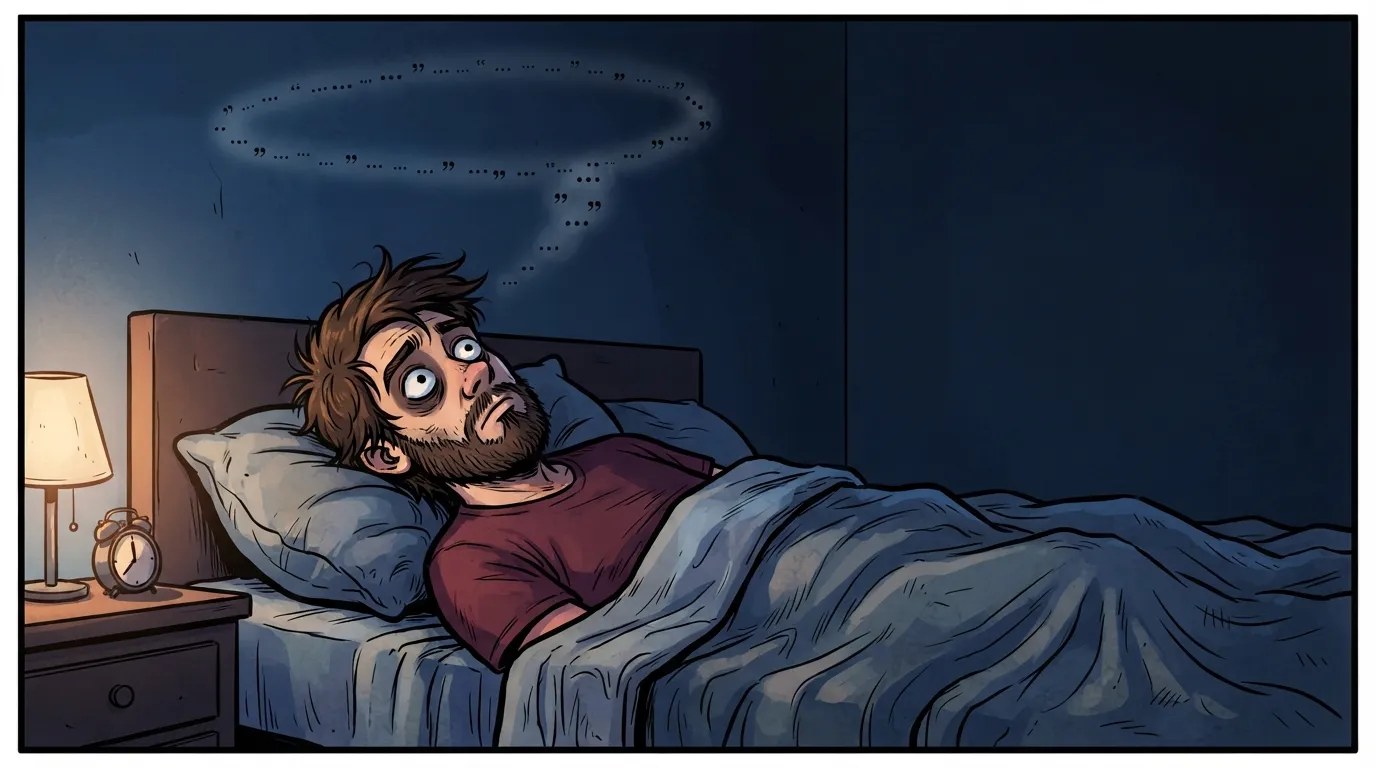
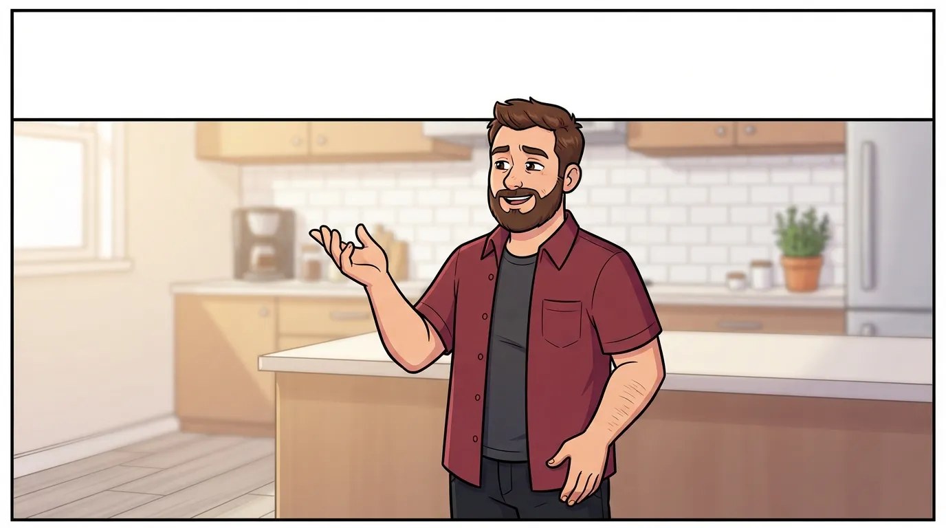
Image generated first, text added in a separate step. See the note in Part 4 on why we still recommend a traditional editor for the text layer rather than an AI tool's own text step.
Mistakes and quick reference
| Mistake | Consequence |
|---|---|
| Worrying about AI disclosure for thumbnails | Not required — YouTube classifies thumbnail creation as production assistance. |
| Using AI to put a real person's likeness on a thumbnail | This is the actual risk. YouTube's thumbnails policy names AI likeness copying specifically. |
| Implying an association or endorsement that does not exist | Impersonation, under the same policy. |
| Using trademarked material | YouTube enforces trademark holder rights. |
| Thumbnail that oversells the video | Misleading thumbnails violate the spam and deceptive practices policies — strikes or removal. |
| Letting the AI render your text | Least reliable part of image generation, and the part you most need control over. |
| Putting content in the bottom right | Covered by the duration overlay. |
| More than 3–5 words | Unreadable at mobile size. |
| Low contrast text | Yellow on white is the named failure. Use white with a black stroke. |
| Uploading at 640–1000px | Uploads fine, looks pixelated on TVs and desktop. |
| Busy background | Destroys the image at small size. |
| Judging at full size only | Most thumbnail failures are failures of scale. |
| Accepting the first generation | Generate several. The cost is trivial. |
| Using template libraries everyone else uses | Convergence. Your thumbnail blends in. |
| Changing two variables at once when testing | You learn nothing. |
| Chasing CTR while retention collapses | The thumbnail is overpromising. |
Quick reference
YouTube policy — primary
- YouTube Help, "Thumbnails policy" (support.google.com/youtube/answer/9229980). The authoritative source for Part 1's risk section — unauthorized impersonation, AI likeness copying, trademark enforcement, and Community Guidelines coverage of thumbnails.
- YouTube Help Center disclosure guidance, as reproduced across multiple 2026 creator guides — the "disclosure is not required" list covering unrealistic content, animations, special effects, and production assistance (AI scripts, thumbnails, outlines).
Analysis and creator guides
- Gyre, "Are AI thumbnails ruining YouTube or revolutionizing it in 2026?" — the most useful single analysis source, covering the production-assistance classification, the absence of a confirmed algorithmic penalty, and the branding-durability argument in Part 6.
- ThumbMagic, "YouTube Thumbnail Size (2026): 1280x720 Specs + Safe Zones" — the source for Parts 2 and 3, including pixelation thresholds, contrast guidance, category color conventions, and the bottom-right safe zone warning.
- ShortsFast, "YouTube AI Content Disclosure Rules 2026: Complete Creator Guide" (July 2026) — the disclosure-is-not-required list and worked examples distinguishing realistic AI scenes from animated/illustrated ones.
Caveats
Policy verified against YouTube Help in August 2026 — this area is actively changing, re-verify before publishing anything that states the disclosure exemption as permanent. The May 2026 automated-detection rollout for photorealistic AI content is confirmed for general content; whether it extends to thumbnails specifically is not established. Category color conventions in Part 3 are observed patterns, not YouTube rules. This is not legal advice — platform policy compliance is between the creator and YouTube.